
Selecting The Right Colors & Fonts For Your Squarespace Website
Building your Squarespace website is just a part of the job, the rest is designing it to match your brand. That is why the Brad Good team wanted to share a short but helpful guide on how to select the best colors & fonts to match your brand when designing your Squarespace website.
Read on below for the tips!
1. Match Your Fonts & Content

It's important to match your website's design to the ideas and objectives of what your content is about.
A blog about medieval manuscripts might look good in Arial, but a serif font is probably truer to its character. If you’re writing a blog about modernism or technology, a sans serif font creates a tight, contemporary mood.
Every font was designed for a purpose. Comparing the theme of your website with a font can tell you a lot about whether they belong together.
When selecting a font, asking the following questions can help narrow down the choices to what will appeal to your unique audience:
Who will be visiting your site?
What’s their age?
What's the website about?
What's its theme?
Once you’ve got a feel for the tone and texture of your site, Squarespace puts the Typekit and Google Fonts libraries at your fingertips, so you can easily find a font to match your unique style.
For help setting fonts, visit Changing fonts.
2. Pair Up
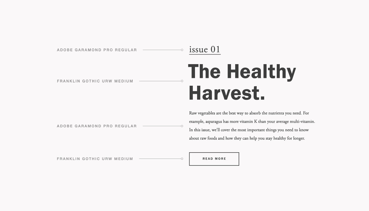
If you’re using a simple sans serif font, try pairing it with an ornate, serif font. Using Franklin Gothic? Try balancing it against Adobe Garamond.
Thin, intricate fonts pair well with bold fonts. Every typeface adds its own personality and voice to the conversation, so selecting the right combination can be the difference between a harmonious duet and a shouting match. To get started, try finding a serif and sans serif that you feel match the rhythm and mood of your site.
As a general rule, it’s best not to have more than two fonts throughout your site. When it comes to typography, less really is more. Two complementary choices make your site readable, while tastefully highlighting the key points.
3. Color Creates Character

What is your website’s big idea? If you’re selling beachwear or showcasing your portrait photography, matching your site’s content to a color scheme can create its character. Beachwear could work with soft blue and yellow tones, while classic black and white lets your original photography shine through. A great place to start is with your imagery. Look at your images and see if there are certain colors or tone that appear again and again.
Whatever your vision, there’s a color scheme that can show what you’re about. Varied hues, shades, contrasts—each one affects the eye, telling the world a different story about who you are.
If you’re seeking inspiration for the perfect color palette, take a look around you. If you own a restaurant, let its color scheme be your guide. Blogging about nature? Earth tones may conjure the proper tone. But like with typography, too many colors can muddle the message. It’s best to find two complementary colors to anchor your site, then vary those hues just slightly for the occasional accent.
Just make sure the colors don’t clash. Yellow type on a white background can make your text illegible, while a black font on a red background is headache-inducing to some.
For help with changing colors on your site, visit Changing colors.